Adjust the Series Template
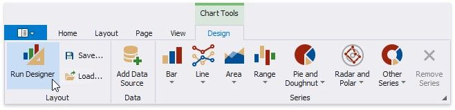
1.Switch to the Chart Tools toolbar tab and click Run Designer.
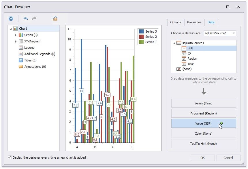
2.In the invoked Chart Designer, go to the Data tab to the right of the designer's window. Select a data source in the corresponding drop-down list and drag-and-drop the data fields onto the corresponding cells.
The Series cell specifies a data field that should provide data for series names. A new series should be created for each record in this data field. Use the Argument and Value cells to define where to get data for point arguments and values.
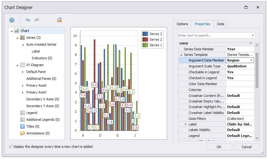
3.Switch to the Properties tab and expand the Series Template option. The Argument Data Member and Value Data Members properties are automatically assigned to the corresponding data fields. Make sure that the Argument Scale Type and Value Scale Type properties are set to appropriate values.
Customize the Chart
Perform the following customization to improve the chart's appearance:
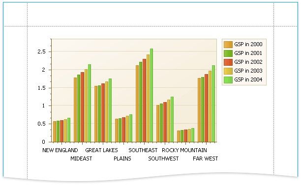
Use the chart's Series Name Template property to add text to the beginning or end of each series name. For example, set the Begin Text inner property to "GSP in ".
Set the Labels Visibility property to False to avoid overlapping series labels.
Specify the color settings used to draw the chart's series. For instance, select Nature Colors in the Palette's drop-down list.
View the Result
Switch to Print Preview to see the resulting report.