Pie Map
The Pie Map dashboard item allows you to display pies on the map. Each pie visualizes the contribution of each value to the total.
Topics in this section describe specific capabilities of the Pie Map dashboard item.
Providing Data
Pie Options Coloring
Legends
Providing Data
This topic describes how to bind the Pie Map dashboard item to data using the Dashboard Designer.
The Dashboard Designer allows you to bind various dashboard items to data in a virtually uniform manner (see Bind Dashboard Items to Data for details). The only difference is in the data sections that these dashboard items have.
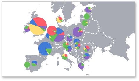
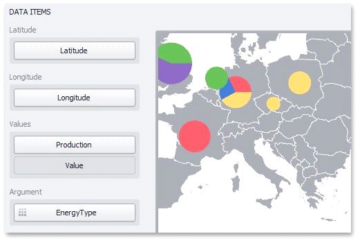
The image below shows a sample Pie Map dashboard item that is bound to data.
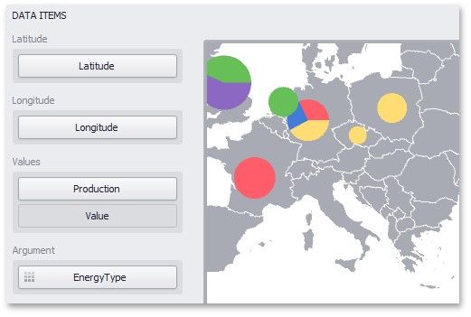
Note that the Pie Map provides two data item groups for data binding: DATA ITEMS and TOOLTIP DATA ITEMS. Tables below list the available data sections.
DATA ITEMS
SECTION |
DESCRIPTION |
Latitude |
Accepts a dimension used to provide geographic latitude. |
Longitude |
Accepts a dimension used to provide geographic longitude. |
Values |
Accepts measures used to calculate pie values. In case of negative measure values, Pie Map uses their absolute values. If you added a data item to the Argument section and several data items to the Values section, you can use the Values drop-down menu to switch between the provided values. To invoke the Values menu, click the |
Argument |
Allows you to provide data for pie arguments. |
TOOLTIP DATA ITEMS
SECTION |
DESCRIPTION |
Dimensions |
Accepts dimensions allowing you to add supplementary content to the tooltips. |
Measures |
Accepts measures allowing you to add summaries to the tooltips. |
Pie Options
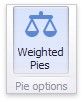
The Pie Map dashboard item allows you to take into account the weight of pies. In this case, the relative sizes of the pies depend on the corresponding summary values.
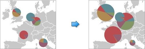
To enable this capability, use the Weighted Pies button in the Design ribbon tab.
Coloring
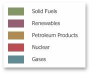
In Default color mode, the Pie Map dashboard item colors its segments in the following way:
If the Pie Map dashboard item contains arguments (the Arguments section), different argument values are colored by hue. If the Pie Map dashboard item contains only measures (the Values section), values corresponding to different measures are colored by hue.
The image below illustrates the Pie Map dashboard item whose argument values are painted in different colors. A special icon (![]() ) on the data item shows that color variation is enabled.
) on the data item shows that color variation is enabled.
Legends
The Pie Map provides two types of legends used to identify map objects - color and weighted legends.
Color Legend Weighted Legend
Color Legend
The color legend helps you to identify which colors correspond to specific argument values.
To display a color legend within a map, use the Show Color Legend button in the Color Legend section of the Design Ribbon tab.
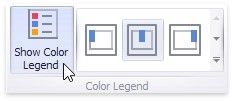
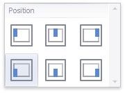
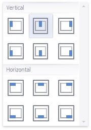
To specify the legend's position and orientation, select one of the predefined options from the gallery in the Design Ribbon tab.
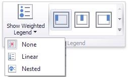
Weighted Legend
The weighted legend allows you to identify values corresponding to specific pie sizes.

To select the required weighted legend type, use the Show Weighted Legend button in the Weighted Legend section of the Design Ribbon tab.
To specify the legend's position, select one of the predefined options from the gallery in the Design Ribbon tab.