Coloring
The Dashboard Designer allows you to paint dashboard item elements such as chart series points or pie segments.
Supported Dashboard Items
You can paint the following dashboard items:
Chart
Scatter Chart
Pie
Pie Map
Range Filter
Treemap
Color Scheme Overview
The dashboard supports two ways to color dashboard item elements:
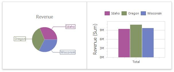
![]() A Global Color Scheme uses consistent colors for identical values across the dashboard. The image below shows a dashboard that contains Pie and Chart dashboard items. Pie segments and chart series points that correspond to Wisconsin, Oregon and Idaho dimension values use identical colors from the default palette.
A Global Color Scheme uses consistent colors for identical values across the dashboard. The image below shows a dashboard that contains Pie and Chart dashboard items. Pie segments and chart series points that correspond to Wisconsin, Oregon and Idaho dimension values use identical colors from the default palette.
For a global color scheme, the dashboard reserves automatically generated colors for specific values regardless of the filter state.
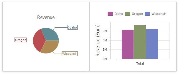
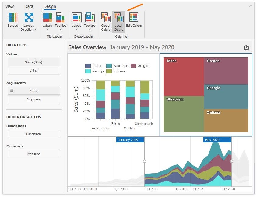
![]() A Local Color Scheme uses an independent set of colors for each dashboard item. The image below shows Pie segments that use colors from a local color scheme. These colors do not affect the Chart items that use a global scheme.
A Local Color Scheme uses an independent set of colors for each dashboard item. The image below shows Pie segments that use colors from a local color scheme. These colors do not affect the Chart items that use a global scheme.
For a Local color scheme, the dashboard reassigns palette colors when the filter state is changed.
Color Measures and Dimensions
You can use predefined color modes to paint individual dimensions or all measures in a dashboard item.
The following color settings are available:
COLOR MODE OPTION |
DESCRIPTION |
Default |
Enables or disables coloring depending on the dashboard item's type. For example, for TreeMap arguments and Chart series, Default means Hue. For Chart arguments, Default means None. |
Hue |
Elements use different colors. |
None |
Elements use the same color. |
Documentation
Refer to the following help topics for more information on how to configure color variation in the WinForms Designer:
Coloring Concepts
Customizing a Color Scheme
Coloring
The Dashboard Designer associates dimension values/measures and specified colors to paint dashboard item elements. This topic describes how to configure color settings in the WinForms Designer.
Coloring Basics
The following concepts are common to both Desktop and Web Dashboard controls:
Color Modes
Color Schemes
Supported Dashboard Items
Refer to the following topic for more information about common concepts: Coloring Basics.
Color Mode: None
You can disable default color variation for dashboard item elements.
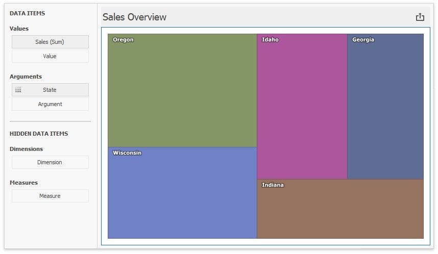
If you add a TreeMap to a dashboard, individual elements (titles) use different colors:
State values (Arguments) use different colors. To disable color variation, go to the Argument settings and select Color by | None.
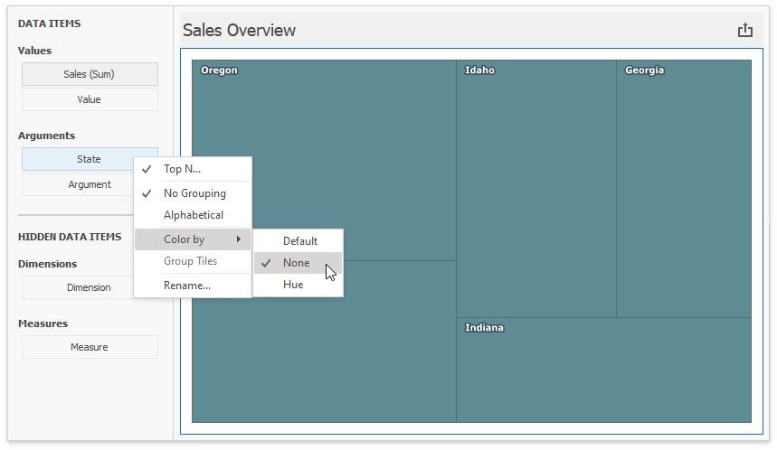
Add a Chart with the same Argument and Value as in the TreeMap:
Note that Default means None for chart arguments.
Color Mode: Hue
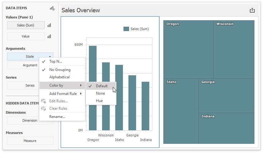
You can enable colors in previously added Treemap and Chart items.
Set the TreeMap's color mode to Default or Hue:
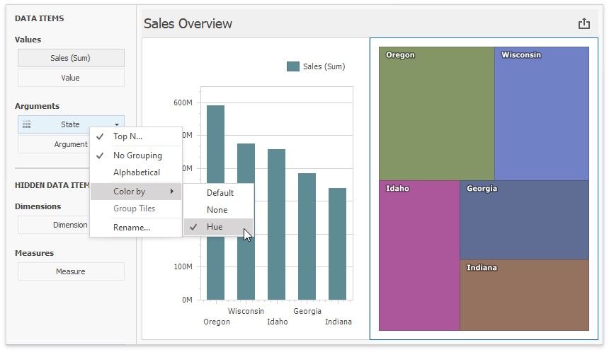
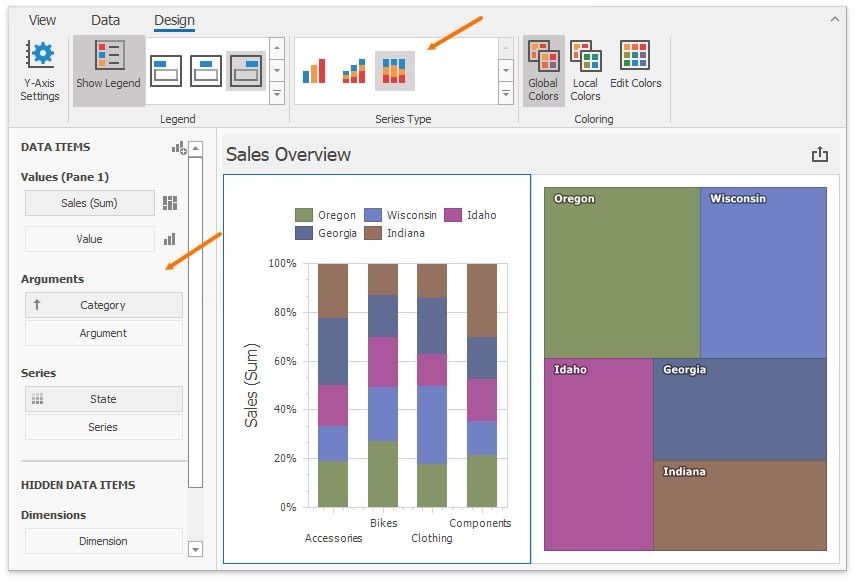
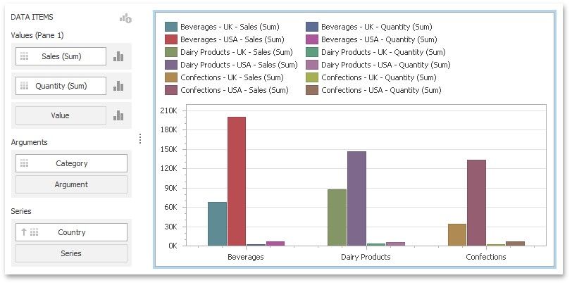
In the Chart settings, move State from Arguments to Series. Default now means Hue in this new context. The coloring indicator ( ![]() ) on the data item shows that color variation by hue is enabled.
) on the data item shows that color variation by hue is enabled.
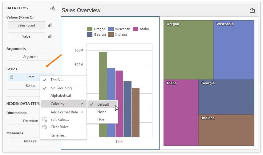
Add Category as a chart argument and switch to 100% Stacked View:
Use Global Color Scheme
The same State data items use identical colors. Dashboard constructs a Global Color Scheme for this purpose.
Add a Range Filter with the following settings:
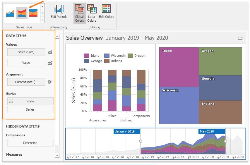
Corresponding State fields are painted with the same colors, so you can associate and compare data from all dashboard items.
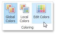
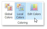
This happens because all items use Global Colors (the default setting). You can see the switch to Global Colors in the Ribbon. Click Edit Colors to modify the colors used in the palette:
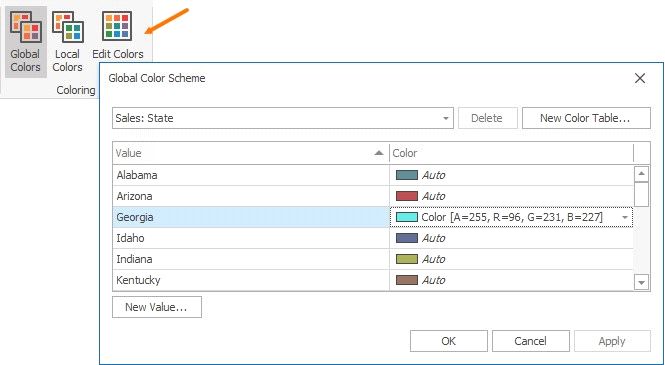
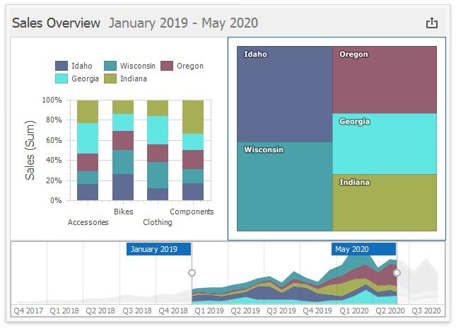
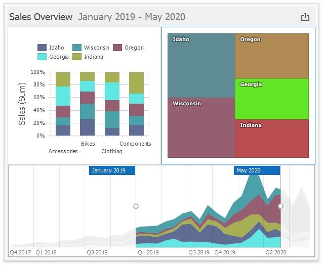
This is how the Dashboard appears after you change the color for Georgia in the palette:
Use Local Color Scheme
If you want to use an independent set of colors in the selected dashboard item, switch to the Local Color Scheme.
You can see the Treemap's arguments that use colors from the Local Color Scheme:
Colors modified in the local color scheme do not affect items that use the global color scheme. The following image shows a custom color for Georgia in the Treemap:
Dashboard Item Color Mode Specifics
Chart - Coloring
Scatter Chart - Coloring
Pie - Coloring
Pie Map - Coloring
Range Filter - Coloring
Treemap - Coloring
How to Customize a Color Scheme
Refer to the following topic for more information on how to customize a color scheme:
![]() Customizing a Color Scheme
Customizing a Color Scheme
Customizing a Color Scheme
The Dashboard Designer provides the capability to edit colors contained in global and local color schemes. You can select the required color from the default dashboard palette or specify a custom color.
Invoke a Color Scheme Dialog
Edit Colors
Add a New Value
Add a New Color Table
Invoke a Color Scheme Dialog
To edit colors, use the Color Scheme dialog. You can invoke this dialog in the following ways.
![]() To edit colors in a global color scheme, use the Edit Colors button in the Home ribbon tab or the Edit Colors button in the dashboard item's Design tab.
To edit colors in a global color scheme, use the Edit Colors button in the Home ribbon tab or the Edit Colors button in the dashboard item's Design tab.
Lets consider a Chart dashboard item whose dimensions and measures are colored by hue using local colors.
For this dashboard item, the Color Scheme dialog will contain combinations of all dimension values and a specific measure.
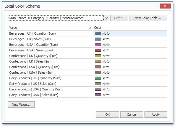
In this dialog, you can perform the following actions.
Edit automatically assigned colors or specify new colors.
Add new values to a color table.
Add new color tables containing values whose colors are not yet assigned.
Edit Colors
You can customize automatically assigned colors in several ways.
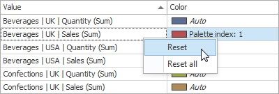
![]() To retain the automatically assigned color for the selected value, right-click the required value in the Value column and select Retain this color.
To retain the automatically assigned color for the selected value, right-click the required value in the Value column and select Retain this color.
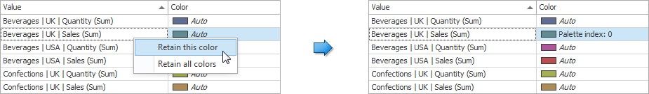
This reserves the current palette color for the selected value.
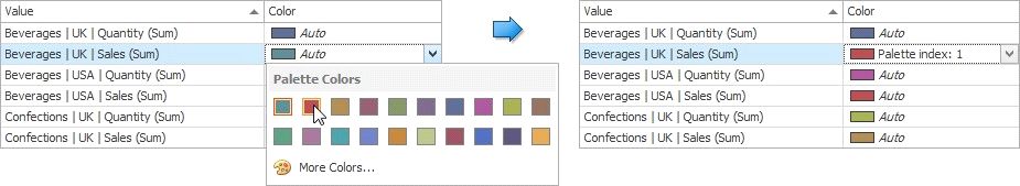
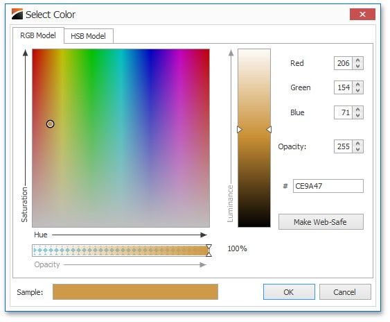
You can select another palette color by clicking the required cell in the Color column.
You can reset the customized color for the selected value using the Reset menu item.
Add a New Value
The Color Scheme dialog allows you adding a new value with the specified color to the selected color table. To do this, click the New Value... button.
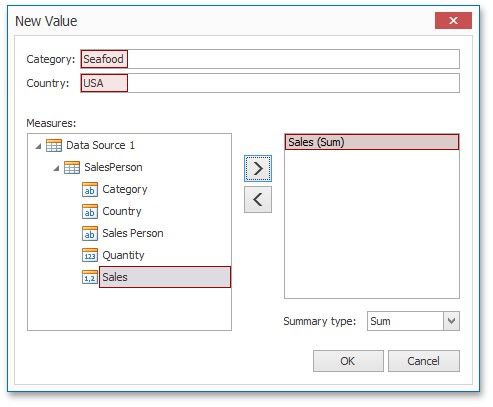
In the invoked New Value dialog, specify the dimension values, add the required measures and click OK. This creates a new value whose color can be specified as described in Edit Colors.
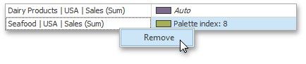
You can remove manually added values using the Remove context menu item.
Add a New Color Table
The Color Scheme dialog also allows you to add a new color table containing values whose colors are not yet assigned. To do this, click New Color Table... button.
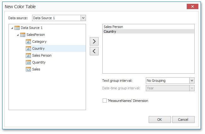
In the invoked dialog, specify the data source, add the required dimensions and enable the 'MeasureNames' Dimension checkbox if you need to add measures to a color table.
Click OK to add the color table to a color scheme. Then, you can add values to this table (see Add a New Value) and specify its colors (see Edit Colors).